Friday 1 October is Walk to Work Day. Walking to work is a great way to stay active and healthy. It's also a great excuse to leave the car at home and save some carbon by walking!
Now in it's 12th year, participants are encouraged to register. Visit the website for more information.
If you can't walk all the way to work, then try these suggestions on National Walk to Work Day, then use public transport and get off the bus, train, tram or ferry a few stops earlier and walk the rest of the way to work. If you must drive, leave the car at least a kilometre from your destination and walk the rest of the way.
Visit the Walk to Work Day website - http://www.walk.com.au
Coincidentally, the first Friday of every month is our 'NO PRINT DAY' so we're certainly doing our bit! Tell us what you're doing!
www.styleplantation.com
About Me

- Style Plantation
- Style Plantation offers a revolutionary range of renewable and sustainable products to enhance your life while saving our planet. With beautifully appointed showrooms and a team that literally 'walks-the-talk', Style Plantation is one of the leading specialists in Australia. We believe that our commitment to the environment goes further than our range of products and services, it is about our actions as individuals.
Tuesday, September 28, 2010
Design: Going Japanese
The months of July and August are the moths of many celebrations and festivals in Japanese culture. Just recently we had the Star Festival called Tanabata: a celebration of the very lovely tale of two lovers Hikoboshi, the herder, and Orihime, the weaver. The Emperor of Heaven became angry with them for getting lazy and banished them both to opposite sides of the Milky Way. However, after seeing the heartbreak his harsh decision had caused he allowed them to cross the Milky Way and meet once a year on the night of July 7th.
Around this time children write wishes on paper strips and decorate bamboo branches with them. Shopping arcades also decorated with colourful paper strips.
To see these (sometimes quite large) brightly coloured, whimsical decorations feels to be very much in contrast to the style of design and decoration seen in Japanese modern architecture, interiors and gardens.
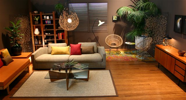
Japanese interior styling is very much in line with: less is more and quality over quantity.
Designs are very simple, functional and clutter free. Furniture tends to be grouped or placed towards the centre to allow for free visual flow and physical movement around the perimeter. This way, walls are an important element of the overall scheme with perhaps an alcove to display an important collectible piece in a key location, or a place for a single, impact piece. When choosing colour, neutrals will help with the underlying look of orderliness. With neutrals taking their hues from nature, off whites and blacks do not clash. Vivid colours are used only sparingly to stand out, to stand alone in a single object or architectural feature.
Some Japanese textures and materials that immediately come to mind are cedar, rice paper, maple, bamboo, stone, and woven wicker. One might also think of textured silk, tatami floor mats, and the elaborate needlework of kimonos and obi’s.
as a focal point, like for example, red lacquer on a single bamboo post or column.
As with colour, when decorating aim for a balance of opposites. Interior finishes can be highly opposing and contrasting, and yet achieve balance. Some examples are for instance, highly polished floors with heavily textured mats, a lacquered box displayed on top of a rough wooden table, or white pebbles on a polished black granite ledge around a tub; A long grained cedar wood table or bench with a perfectly crafted, shining lacquered box. Floors of engineered bamboo hardwood surrounded by a single slab of quarry stone or polished concrete; Heavy texture of natural fiber mat with stretched taunt leather seating.
There is nothing new about Japanese interior design features. They have slowly and tastefully evolved over centuries. Even though western influences are increasingly noticeable, improvements in materials and processes are being made, the basics have been graciously preserved.
Around this time children write wishes on paper strips and decorate bamboo branches with them. Shopping arcades also decorated with colourful paper strips.
To see these (sometimes quite large) brightly coloured, whimsical decorations feels to be very much in contrast to the style of design and decoration seen in Japanese modern architecture, interiors and gardens.
Japanese interior styling is very much in line with: less is more and quality over quantity.
Designs are very simple, functional and clutter free. Furniture tends to be grouped or placed towards the centre to allow for free visual flow and physical movement around the perimeter. This way, walls are an important element of the overall scheme with perhaps an alcove to display an important collectible piece in a key location, or a place for a single, impact piece. When choosing colour, neutrals will help with the underlying look of orderliness. With neutrals taking their hues from nature, off whites and blacks do not clash. Vivid colours are used only sparingly to stand out, to stand alone in a single object or architectural feature.
Some Japanese textures and materials that immediately come to mind are cedar, rice paper, maple, bamboo, stone, and woven wicker. One might also think of textured silk, tatami floor mats, and the elaborate needlework of kimonos and obi’s.
as a focal point, like for example, red lacquer on a single bamboo post or column.
As with colour, when decorating aim for a balance of opposites. Interior finishes can be highly opposing and contrasting, and yet achieve balance. Some examples are for instance, highly polished floors with heavily textured mats, a lacquered box displayed on top of a rough wooden table, or white pebbles on a polished black granite ledge around a tub; A long grained cedar wood table or bench with a perfectly crafted, shining lacquered box. Floors of engineered bamboo hardwood surrounded by a single slab of quarry stone or polished concrete; Heavy texture of natural fiber mat with stretched taunt leather seating.
There is nothing new about Japanese interior design features. They have slowly and tastefully evolved over centuries. Even though western influences are increasingly noticeable, improvements in materials and processes are being made, the basics have been graciously preserved.
Subscribe to:
Comments (Atom)